Lorena Mitchell

Projects
Open MFA Digital Residency
Fall 2017—Spring 2020
Digital Residents

Lorena Mitchell
Lorena Mitchell is a Houston native and graduated from the University of Houston with a BS in Digital Media. Lorena has had a life-long interest in art and animation and draws her inspiration from trends in fashion and beauty.
Website / Instagram
Lorena Mitchell is a Houston native and graduated from the University of Houston with a BS in Digital Media. Lorena has had a life-long interest in art and animation and draws her inspiration from trends in fashion and beauty.
Website / Instagram

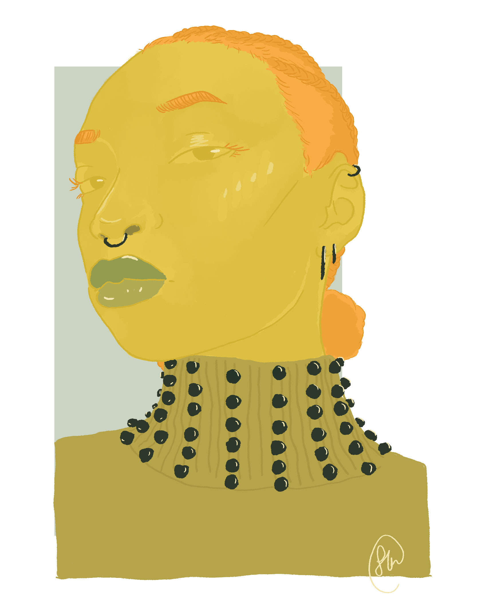
“I read a lot of fashion blogs and occasionally I find it amusing to read the words they use to describe certain trends. From a recent article, the author created the word "renaissancecore" to describe the resurgence of velvet, brocade, cinching and pearl in the fashion industry….This art piece and article from Man Repeller (great name) were my initial inspiration for my "renaissancecore" series. I'd been looking at earrings before I made this piece and wanted to recreate the image of the model in one of the limited color palettes that I have saved. I think the article resonated with me because I liked the styling of the model and the clothes selected for the article, even though it all feels a little too elaborate to wear for everyday. There was also a fun debate in the comments to whether the style of clothing was more renaissance, baroque or victorian.”

“...She has a bit of a severe expression; I don't think I've ever seen anyone in a renaissance painting look happy.”

"An animated take on the halo, inspired by Quentin Metsys's 'Christ'. I like the clash of the purple against the muted pinks and oranges. I read somewhere that the color of the halo determined whether it was meant to represent light (golds, white) or flames (red); I guess this one is a cold flame."


“A lot of the time when I'm sketching I'll have extra elements that I leave out or change in for the final piece. I find it easier to self-edit in digital art, because I can turn a layer on or off if I want to change the design. I also tried out a new brush pack for this one to give it a more textured look; I'm not sure if it's the way I imaged it to be.”

“I started out with a much more monochromatic colorway for this one, which I thought would be more challenging to do, but I actually finished this pretty quickly. I think having to work with similar colors made me spend less time thinking about where I wanted to use them.”

“This piece has the boldest palette from all of the other works that I'm doing for this series. I have an old Tumblr post that has 100 different 5-7 color palettes that I've been picking from. I still haven't used all 100 options yet because some of the combinations make me nervous.”


“This was the first piece in this series that I started, but I ended up hating the initial color scheme, so I stopped working on it and started some of the other pieces instead. After redoing it in pink and brown color scheme, I'm much more pleased with how it turned out. It seems fitting to make this my last piece.”